
Tuesday, December 6, 2011
Studio: IAR 201 Overview
The idea from the beginning of this semester was to explore ourselves as designers and to discover our own individual identities as a designer. At first I though that it was going to be difficult to do this because of how much time we were going to be spending on group work this year but reflecting back I think that group work really helped me to discover my design voice. It was difficult working with 9 group members on one project because there were ideas coming from every way and it was hard to find a way to get my voice heard. As time went on I started to focus on the strengths I could bring to the group such as presenting, brainstorming, and modeling. It also helped me to learn from other class members on how to be a better designer. I followed and practiced these things that I had learned and carried them out into our Cabinet of Curiosity project. At the beginning of the semester I really wanted to be able to develop and process my designs better along with being able to collect and explain my designs. Overall, I think that I have discovered ways to do this and have developed a style and identity of design that I will carry out through my studies as a designer.
IOB Concept
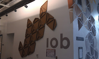
When considering a concept of our project we began to think about the things that define the IOB and their connection to the community. The IOB community itself has a lot of history and has endured a lot of changed and hardships but is still a growing company. They are very prideful of what they do and have been a strong company that sticks together as a family which makes them even stronger. We wanted to find a way to reflect this to the Greensboro community. Through research we discovered that the symbol for Greensboro is a White Oak and we started to think of the parts that make up a tree and what a tree stands for. From down to the parts we broke up the roots of a tree as being the roots of the IOB company. This is what gives the tree and the company its core strength. The trunk brings the company and the tree its stability. This is the companies workers and management. We then head to the branches and leaves and how this is the part that people usually notice on trees. This is the part of the company that reflects to the community. As a tree continues to grow so does our final design as it grows and spreads throughout the IOB reflecting the story of the company. So this is how we developed our concept, White Oak because an oak symbolizes the Industries of the Blind's strength, endurance, and ability to adapt to charging circumstances over years.
Cabinet of Curiosity
Our final project in studio 112 developed through the collaboration with first year studio. First year was given a project to design an object holder based on a partners needs for a particular interest. For example, a ticket holder was designed for a student who needed a place to put her bus tickets. From there, our second year studio was given 3 first year object each and asked to design a cabinet in which all three objects can be harmoniously displayed. The cabinet was to be any size, any shape, and made from any material as long as it helped to display the three objects cohesively.
For my specific cabinet, my objects consisted of a hairtie holder, a martini glass holder, and a pen holder. The hairtie holder is a 3 ½” x 3 ½” wooden box with inlaid geometry shapes on the outside of the box. The martini glass holder is wooden shadow box in which the martini glass will sit. The shadow box is the outline of a standard martini glass. My final object is a 3” x 12” x 3” pen holder. The top and bottom of the holder is made of thin wood and has an inset shape that complements the placement of the pens. The sides are made from acrylic. When looking from the sides, the shape of the holder is in an extended hourglass shape.
When trying to think about a design for a cabinet in which to place these three very individual objects I tried to find connections between all three to help me develop a concept for a design. After thinking and processing the object I found connections through the shapes of each object. Each object is simple in its basic form consisting of straight lines and sharp angles. From this concept of angularity I began to develop and design my cabinet. At first I played with the hourglass shape but was sticking to a very basic 5 sided rectangular box. I then began play around with angles and connecting angles and started abstracting my general boxy thoughts about a cabinet. From here I developed the shape of my final cabinet.
My final cabinet consists of 2 individual parts joined together by a mortise tenon joint. The top part measures 14” x 18” with a 45 degree angle. The bottom piece measures 14” x 16” with a 45 degree angle. The bottom piece has an extension on which the cabinet rests measuring 6” with a 120 degree angle. The top section pierces the center of the top of the bottom piece and extends down holding the cubed hairtie holder in place. The pen holder rests at an angle right at the end points of the cabinet’s 45 degree angles. The martini glass holder then rests on the top of the bottom section with the top section overarching. The cabinet is made of acrylic which helps to simplify the cabinet and bring focus to the three objects contained within the cabinet.
My cabinet is based on the concept of angularity and connection through angles. With this cabinet’s design all three object flow together because the shape of the cabinet helps to connect all three pieces. When looking at the cabinet one’s eyes flows with the angles of the cabinet to the objects placed inside. Each object is touching an end of the cabinet so that as the eye flows over the cabinet’s form each joint and end point connects with one of the three objects.

IOB Interview Stage
Our first approach for the project was to gain insight about the IOB from the employees and management through interviews. We asked basic questions such as how long they have worked for the IOB, how did they become employed at the IOB, do they like working at the IOB, and also more personal questions to understand each employee better. Although each individual had their own history that brought them to the IOB, they each had great pride in the work that they do and also were very thankful for the opportunities and independence that the IOB has provided them. In looking at the company as a whole, the employees that worked at the IOB for 20+ years felt that the company has made positive improvement in the structure of management. The company today is more unified and family oriented. Every employee who we interviewed said they loved all the people at the IOB and also the one-on-one contact made them feel like part of the company rather than just an employee. During the interviews we also asked the employees what they think could be done to improve the structure of the building, how they navigate throughout the building, and how we as designers can make the Greensboro community more aware of the IOB. Some of the things mentioned were, wider hallways, more lights, more floor lines throughout the building to help guide. Some of their suggestions to make the community more aware of the IOB were displaying history in a way that guided people throughout the factory.
History of the IOB
History Facts:
Company was founded in 1933 with six employees producing mops.
IOB was the first agency to employee blind people.
Took current name in 1938
During WWII the company grew to 35 employees and also began construction on the current building located on West Lee St.
In 1962 IOB entered into its first million dollar contract.
In 1968 additional contracts followed including the production of clipboards and pens.
Today the IOB employees over 100 blind employees working in 5 different distribution and production sections of the factory.
The IOB produces brooms, pens, clipboards, mops, military gear, and recently has been contracted to produce parachutes for the military.
The IOB is a non-profit organization that develops new business opportunities and serves contracts from the government.
There are 84 NIB associated agencies located nation-wide employing approximately 5,000 individuals who are blind in manufacturing, service, professional, supervisory, and management positions. These individuals choose to work at an NIB associated agency because technology, accommodations, and other specialized services are used to optimize productivity and job satisfaction.
Mission Statement Includes: Building Strong Relationships, Achieving Excellence, Demonstrating Respect, Encouraging Open Communication, Acting with Integrity, Being responsible and accountable.
IOB Final Presentation
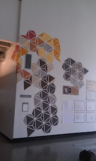
Our Final pin up was an installation that took up the entire lobby wall of the studio building. We had employees, management and board members from the Industries of the Blind show up along with other students and faculty members. We presented our beginning steps through exploring braille and texture to playing with different forms and shapes though our chaotic form. We discussed our concept of using a white oak to represent the connection of history and strength to represent the IOB. We then went on to present our color study and study with the hexagonal form in which we played with negative and positive space. This form also played with the eye. From there we presented our final form in which we incorporated texture to the hexagonal space and used concave and convex spaces and triangles to guide people throughout the IOB space and also display history. Overall I think that our presentation went fantastic and the IOB board and employees loved it! As a group we were all very proud of our final design and it was easy to see how much work went into this project from the beginning.


Friday, November 4, 2011
IOB Final Pin Up
This is the pin up we have been working on for the last week to display downstairs so that other students and passerbys can see our design and make comments/suggestions for it. Also, this is the insallation presenting our final design that we wish to show the IOB management, employees, and board members.


Thursday, November 3, 2011
Blog Post 005
This is a rough draft of what we will be presenting for the IOB final presentation. For this presentation we will be presenting a detailed process book explain out design and the steps taken from beginning to end.


Front Page: Concept
I am still revising the concept as of right now. We had discussed changing it into more of a general statement that fits our project better. Also maybe a few bullet points of what the IOB expected from us along with names of designer
Right side starting with:
Textures:
When beginning the project we focused on the study of braille as a way to relate the nature of the company into our design. We made sketch models of textures in different scales from the idea of braille. As we moved throughout the texture studies we began to abstract our ideas and began to play with more angular shapes and textures.
Lighting:
Our next step in the process was to experiment with lighting and how we would apply it to the space. We collect several light studies using the sketch models we had produced and playing with learning and exploring how light reflected off each individual for.
Color:
When considering color schemes within our design we focused on using warm colors to help tie in the idea of harmony, protection, unity, and community that represents the essence of the IOB Company.
Chaos Tree:
From angular shapes and forms we idealized an outside graphic installation that would help to draw people into the IOB. This form would also become a symbol for the IOB and part of the interior design. Our original model was a study of very chaotic, playful triangles and shapes composing a tree shape in which positive and negative space played an important role in the design.
Hexagon Study:
In trying to find order in chaos we began exploring more structured forms. We experimented with a hexagon and the individual parts in which it can be assembled. From there we discovered a tessellated design that brought in unity along with order. It also played well with the use of positive and negative space allowing for a play on eyes.
Hexagon Texture:
Once we had a final design we started back from the beginning. Texture was an important part of representing the IOB and allowing for a heighten in the sense of sight so we began playing around with textures for the hexagonal pattern. From there we chose the design that could best be used as a way finder and way to explain the history of the IOB along with what would fit the spaces in which we were designing.
Application Studies:
These will be images of the installation downstairs and also of the perspectives throughout the process
Lobby:
Images and digital rendered images for the lobby space incorporating the new design.
Cafeteria:
Images and digital rendered images for the lobby space incorporating the new design.
Conference Room:
Images and digital rendered images for the lobby space incorporating the new design.
Bulletin Board:
Images and digital rendered images for the lobby space incorporating the new design.
Tuesday, November 1, 2011
Halloween Madness
So for a little fun activity on Halloween and a way to collaborate with first year, we all teamed up in groups and played with vegatables! Literally, we took vegtables of our choice and a light source of our choice and were to design a cool light effect. Over the weekend we were to gather materials and on Monday we had 2 1/2 hrs to design our vegtables. It was a fun project and help us to explore light in ways we would never imagine. Our group, group Dracula, used the inspiration of Dr. Suess to design a light tree. We used a Chinese radish, eggplants, and squash as decoration around our can stand.


Friday, October 28, 2011
IOB: Presenting to Richard and David
Last Friday we hosted the president and vice president of IOB at the Gatewood studio to see our progress on the IOB project. We presented our project as we had several times before starting with our inital process and moving into how we developed our design and how we plan in incoopertaing it into the lobby spaces of the IOB. Richard and David were were in awe. There idea for the space was more traditional then what we had but they loved our design and how we used it as a wayfinder and also as way to explain the history of IOB. The input they had was to add more texture because they said they really liked the texture studies and wanted to reach out and touch them. Overall they really liked our design and we feel confident to begin out next processes in our design!
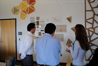
 Look at those happy faces!!
Thursday, October 27, 2011
Lighting! Blog Post 004
Last Friday Scott Richardson came to speak with us about lighting and give us tips on how to improve the lighting within our designed IOB space. One thing concerning lighting with our project is that every eye, even the different types of blindnesses experience lighting different. Older eyes let less light in and one way he talked about making it a happy medium with younger eyes and older eyes in by reducing glare thoughout the space. His best suggestion for this was to decrease the difference between inside and outside light by making then flow together so it is easier for the eye to adjust. When dealing with the different types of blindness and how they experience light he suggested doing studies such as coverning up certian blind spots and walking through spaces with different lighting experience. I thought that this would be really helpful for us. He really liked how our design challanged the eye and thought that through the use of light we could enhance that in our project. He suggested playing with different lighted planes in out textures and also maybe luminating behind some of the triangles. We discussed how floresent is already in the space and he senced our misconceptions about the harsh feeling floresents give most people. He informed us that there are different types of floresent and that we should play around with less harsh types. I think that Scott was very informative and the IOB group plans to meet again with him once we are more developed in our lighting stage of the project.
Monday, October 24, 2011
History 222: Thomas Day Exhibit: My contribution/Ideas on Signage
My contribution will be toward the proposal group for our project. I hope to gather information from the graphics and artifacts group and help to organize it into a solid exhibit of Thomas Day's furniture. We will be splitting up the pieces of his collection into major sections complemented with a timeline throughout the space that ties in each piece. For our exhibit we are using both photographic representation and physical representation so I think that it would be very informative and useful to in cooperate our signage with photographic pieces of Thomas Day's furniture. I think that banner type signage is always helpful and also that the timeline throughout the space would be good to use as a type of way finder throughout our exhibit.
Side Chair Mahogany Veneer by Thomas Day

Side Chair Mahogany Veneer by Thomas Day
Subscribe to:
Posts (Atom)