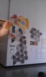
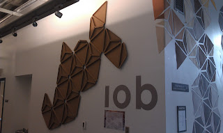
This is the pin up we have been working on for the last week to display downstairs so that other students and passerbys can see our design and make comments/suggestions for it. Also, this is the insallation presenting our final design that we wish to show the IOB management, employees, and board members.
Friday, November 4, 2011
IOB Final Pin Up
Thursday, November 3, 2011
Blog Post 005
This is a rough draft of what we will be presenting for the IOB final presentation. For this presentation we will be presenting a detailed process book explain out design and the steps taken from beginning to end.
Front Page: Concept
I am still revising the concept as of right now. We had discussed changing it into more of a general statement that fits our project better. Also maybe a few bullet points of what the IOB expected from us along with names of designer
Right side starting with:
Textures:
When beginning the project we focused on the study of braille as a way to relate the nature of the company into our design. We made sketch models of textures in different scales from the idea of braille. As we moved throughout the texture studies we began to abstract our ideas and began to play with more angular shapes and textures.
Lighting:
Our next step in the process was to experiment with lighting and how we would apply it to the space. We collect several light studies using the sketch models we had produced and playing with learning and exploring how light reflected off each individual for.
Color:
When considering color schemes within our design we focused on using warm colors to help tie in the idea of harmony, protection, unity, and community that represents the essence of the IOB Company.
Chaos Tree:
From angular shapes and forms we idealized an outside graphic installation that would help to draw people into the IOB. This form would also become a symbol for the IOB and part of the interior design. Our original model was a study of very chaotic, playful triangles and shapes composing a tree shape in which positive and negative space played an important role in the design.
Hexagon Study:
In trying to find order in chaos we began exploring more structured forms. We experimented with a hexagon and the individual parts in which it can be assembled. From there we discovered a tessellated design that brought in unity along with order. It also played well with the use of positive and negative space allowing for a play on eyes.
Hexagon Texture:
Once we had a final design we started back from the beginning. Texture was an important part of representing the IOB and allowing for a heighten in the sense of sight so we began playing around with textures for the hexagonal pattern. From there we chose the design that could best be used as a way finder and way to explain the history of the IOB along with what would fit the spaces in which we were designing.
Application Studies:
These will be images of the installation downstairs and also of the perspectives throughout the process
Lobby:
Images and digital rendered images for the lobby space incorporating the new design.
Cafeteria:
Images and digital rendered images for the lobby space incorporating the new design.
Conference Room:
Images and digital rendered images for the lobby space incorporating the new design.
Bulletin Board:
Images and digital rendered images for the lobby space incorporating the new design.
Tuesday, November 1, 2011
Halloween Madness
So for a little fun activity on Halloween and a way to collaborate with first year, we all teamed up in groups and played with vegatables! Literally, we took vegtables of our choice and a light source of our choice and were to design a cool light effect. Over the weekend we were to gather materials and on Monday we had 2 1/2 hrs to design our vegtables. It was a fun project and help us to explore light in ways we would never imagine. Our group, group Dracula, used the inspiration of Dr. Suess to design a light tree. We used a Chinese radish, eggplants, and squash as decoration around our can stand.
Subscribe to:
Comments (Atom)


