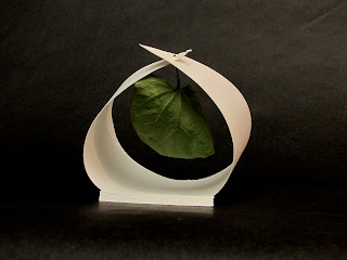
When thinking about this project I found my mind scrambling to figure it out right until the day of critics. I found my whole process of approaching the project, finding a place for a leaf, more simple than I was making it. At first I took the concept very literal, and my immediate idea was to make a tree from the paper so that I can hang my leaf because, this is how leafs are connected with paper in nature. I went and picked out a leaf, made a cylinder from my paper, and hung my leaf from the sides of the shredded top (sketches are provided). As I discussed with other classmates I begin to look at the project differently and my ideas started to evolve. I begin to focus more on my leaf of choice and the characteristics of my leaf. I loved the shape of my leaf and how define the veins in it were so, I wanted to focus on those aspects. My leaf also reminded me a fan or a shade leaf so I wanted to design my place so that it emphasized the shadow my leaf cast. Although this is the aspect that my final prototype focused on it took me a few more trial and errors to get there. My next step to making my place was a little more literal. I cut my paper into the shape of a fan and in the middle I drew out the shape of my leaf. Within that shape I ever so carefully cut out the design of my leaf’s veins, placing my leaf in the back so that the paper veins were in place of my leaf’s veins. As soon as I had finished this prototype I knew it was all wrong. The design took away from my leaf, and also I did not think that it represented my main focus very well. I then tried to focus more on designing a place that focused on the shade of my leaf as you will see in the first picture of the two unfinished prototypes. The leaf was to sit within the ridges and cast shade off the back. The open effect was to allow light in so that the shadows of my leaf would be more define, but I didn’t feel like the design gave my leaf an appropriate place. I went back to my original idea of hanging the leaf and made a design similar to the last one.I tried to make 3 sides so that it would complement the sides of my leaf and also give my leaf a definite spot. I folded and folded and folded and still was coming up short. Out of frustration I cut the back off making my paper just one triangle and completely simplifying it. I folded the sides giving a hanging effect at the top so that my leaf would look like it belonged hanging there. I also proportioned the paper to where the smooth curves complimented the smooth curves of my leaf. The tab in the back allowed the prototype to be propped up for better visibility. I loved cutting the third side off and allowing the back to be open because this way the size worked well with my leaf and gave it a more dramatic effect and a more define place. Also this allowed different shadows to be cast depending on the angle of the light coming in. It gave it more of open feeling, making it feel like the leaf itself felt like it belonged in that place. In the end simplifying my original idea, and expanding it to focus on my particular leaf was all that I needed to do to design an appropriate place for my leaf.
Drawings and Sketches
Working with the shadows and finding a place
Almost there?
Playing with shadows
Playing with shadows
Base and back raise
Drawings and Sketches
Almost there?
Final
Playing with shadows
Playing with shadows
Base and back raise


No comments:
Post a Comment