

Saturday, September 10, 2011
New header Identity

Ah relaxation

This is the prefect place to get away, meditate and just reflect and relax. It makes me think Japanese tea house/ meditation room style with a twist. I wish I had a place of mini-paradise such as this.
Friday, September 9, 2011
GHM exhibit tour experience
As I began the process up the spiral staircase of the Greensboro Historical Museum, the first and only exhibit I found was the period rooms and the pottery display. When first walking into the exhibit, there were a few items on the wall and in a display case presenting clothing. My attention did not linger on those items because within the center of the room track lights highlight the pottery display. The period rooms were located on a semi-circular around the edges of the pottery displays. The layout of the space and also the lighting within the space didn’t attract me to the period rooms. I think the display would have a better affect if it came in full circle, instead of having a random room to the left with a sudden wall. My first steps were to begin to walk around the period rooms. The pathway was pretty dark with illuminating lights within the display room that helped to draw attention to the inside of the room. The rooms were displays of the Belle Meade mansion which is located in downtown Greensboro however, it was hard to understand the rooms because there was nothing showing images of the house or really describing the house and its significance. I felt as if the rooms were just place in the exhibit with no meaning. Altogether I don’t think the period room exhibit was set up in a well-established manner. It was hard for me to see the connection between the two exhibits on display in this area. On the other hand, the pottery exhibit had a nice flow to it. I was immediately attracted to the middle display case that helped to describe what the exhibit was about along with a few examples of the pottery. The exhibit was grouped into 4 distinct display cases. Each case contained descriptive boards of information that was easy to read, along with nice pottery that connected to the reading on the board. From the pottery exhibit you can either enter the gift shop or continue on into a random, awkward space of transition.

From the pottery exhibit I continued on the second floor up the gradation that helps to introduce the next exhibit which is the main and largest; the Voices exhibition. To bring aesthetics to the gradation and make it less drab and boring, quotes and says scattered on the wall help to bring visual meaning to the title of the exhibit. The room opens up into circular shaped room full of images of people throughout different time periods. As you walked around some images spoke telling about significant times in Greensboro. It was an engulfing moment when sitting in the middle of the room because as I looked around into all the faces of the people in the pictures, I began to feel the presence of Greensboro’s history and community. I think this was a nice transition into the rest of the exhibit that explained the history, people, and culture of Greensboro. As I walked through the rest of the exhibit color themes helped me to understand a change in topic. Also, in most areas of the exhibit display panels help to wind you through semi-narrow hallways. As I continued through the very extensive exhibit, I noticed as the topic transitioned from Greensboro’s history to more modern day Greensboro the colors and lighting became brighter within the spaces. Within these areas the overall feel of the spaces felt different however, I do not think this was an effective way to represent the transition from history to modernity. The feeling I had when in these brighter spaces is the feeling I want to feel throughout the whole exhibit but, with the usage of dark colors represented in the other spaces I was unable to obtain this feeling. Overall, I think it is very significant that this is the main exhibit because it has the most artifacts and represents the Greensboro’s history along with the transition into modern Greensboro. The voice and identity of this exhibit’s merging of past and present is something that I think I would want to transfer into the design for the lobby.

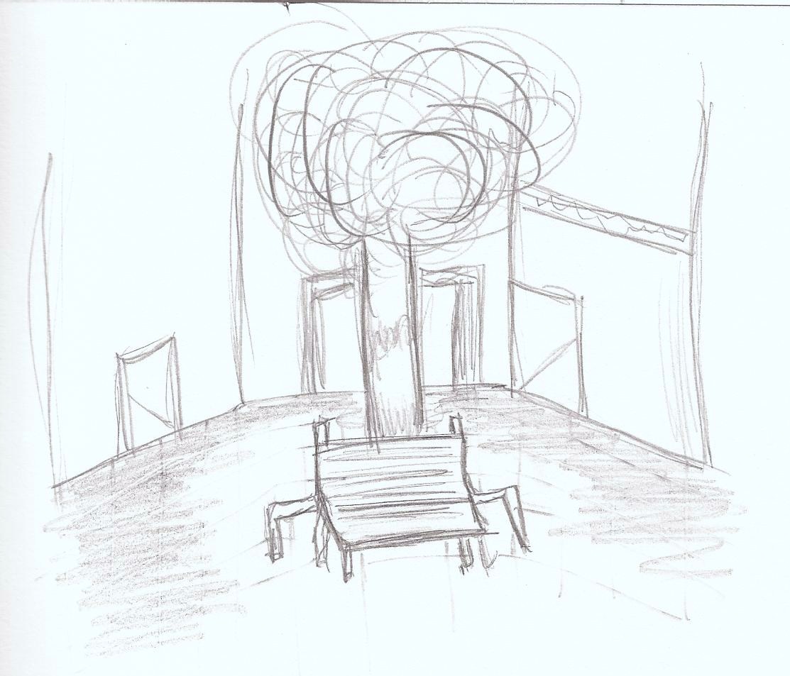
The Gate City exhibit ties you back to the pottery display where I then continued past the gift shop again and up the stairs to the exhibit. This exhibit is overall the most aesthetically pleasing exhibit in the museum. The place is laid out like a small downtown plaza so when I first walked in I felt like I was actually there. The style of the place helps to represent the topics of the exhibit in a very fun way for the user. The user would navigate around the “downtown” area and enter into the school house, theater, drug store, or hotel. Each specific building space described the topics in which it represented. For example, in the drug store you walked in, the lighting was dark and dim as it would have been during the time they are trying to represent and all the artifacts and information you are reading about is place throughout the room in medicine cabinets and such. I think that the exhibit was grouped nicely and they all connected back to the middle tree/benches. From the entrance to the exit of the exhibit it all felt as if I had been placed right that Greensboro sense and time. It also was the only exhibit that used full scale 2D people placed within the exhibit to greet. These life size cardboard people really brought together the idea of the exhibit.
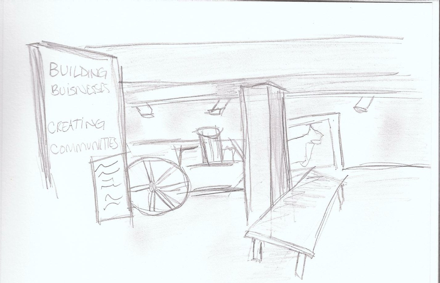
When exiting through the hotel lobby of the Gate City and into the 3rd floor lobby there was nothing to really connect or prepare me for the next exhibit. The only transition from the Down Home exhibit and the 3rd floor lobby was the doorway and change in carpet/wall color. Within the exhibit however, large panels with large lettering and a variety of bold colors help to distinguish the different areas in the exhibit. When first walking in I was immediately drawn to the music and traveled to the alter area where it helps to explain the purpose of the exhibit. I think the identity of the exhibit was clearly spoken throughout however, I don’t think the exhibit had a large impact as a whole when comparing it to the other exhibits. It flowed well once inside but it is on the third floor all the way in to corner with nothing really attracting people to the exhibit. I really did like the panels through this exhibit. They were easy to read and clearly stated the main point of each area. The colors were also dark and bold so it was a smooth transition from one panel and area to the next. I do wonder about the two random columns in the space that seem to be blockers and just in the way. I think that this exhibit needs to be connected more to the main floor lobby displays.
The gift shop is in a random spot on the 2nd floor however, both the exhibits on the 2nd floor do end you around the gift shop so a user cannot miss it when looking through the museum. The gift shop plays folk music which automatically connects with the historical museums concept of heritage. Also, when looking through the museum a lot of what they sell directly connects to the exhibits. For example, a lot of Jewish artifacts and books are sold in the shop. Most of the stuff throughout the shop is handmade. I think that this is important in helping to bring together the identity of the museum as a whole.
Wednesday, September 7, 2011
Pre Project Planning: Picking Groups
I think that I can contribute ideas to the GHM and the IOB better than I would be able to for the WAM. When I toured the two places I had a lot of interesting ideas that I think that I could contribute positively within a group for either of these two projects. I like the idea of the projects because they are both working directly with clients and they are both dealing with making their spaces flow better to attract users. I love the idea of clashing tradition and modernity with the GHM and I equally love the idea of creating displays for the IOB in a well designed manner to attract people to the history and purpose of the factory.
I see my skills coming in handy with both of these projects because they are both working directly with clients and I think that I can work better when I have a little more structure in working with clients along the way. I also think that I can help contribute ideas in a group better with these two project. With these two projects we are able to present a range of ideas and simplify them as we go and I like the ability for the openness of ideas.
I see my skills coming in handy with both of these projects because they are both working directly with clients and I think that I can work better when I have a little more structure in working with clients along the way. I also think that I can help contribute ideas in a group better with these two project. With these two projects we are able to present a range of ideas and simplify them as we go and I like the ability for the openness of ideas.
Tuesday, September 6, 2011
IOB diagrams


Occasion: People come here to work. They probably hold meeting with future companies that will invest their products in the industries of the blind along with conduction meetings with present clients.
Players: Factory workers, people visiting the factory
Resources: Machinery, products
Surroundings: Lee St. Apartments and shops. Close proximity to UNCG campus
How can we draw people into the lobby and strike an interest for them to continue through out the building? The client requests that we incorporate history of the factory, along with achievements of employees.
Monday, September 5, 2011
GHM Diagrams


Thumbnails

Annotative Diagram helps to understand the flow of each floor within the GHM from the main central pathway which is the staircase. Also, it is hard to tell but, the blue area indicate areas of primary usage and the purple areas make secondary usage spaces along with side trips within the lobby of the building.

This refined diagram helps to illustrate the 3 levels of the museum and they key areas within each level. The winding arrow represents the main pathway to all levels which is the staircase. It is also symbolizes the flow within the building which was very chaotic.
Occasions: Class trips, Exhibit events, Guest Speakers, Theater performances
Players: Volunteers, Staff/museum employees, Visitors of the museum. performers including from actors to scholars
Resources: Historical artifacts, Information about the city of Greensboro
Surroundings: Restaurants and shops, The cultural center is not far away. It is hard to distinguish from the street that the old church is a museum because of no large icons allowing it to stand out.
Stated and observed issue within the building to address:
+ Very Chaotic flow. There is no distinct pathway showing you where to go within the building
+Lighting quality of the spaces
+Coloring of the space and the use of color/materials to transition in the space
Sunday, August 28, 2011
WAM Diagrams

Thumbnails


This diagram was a previous drawing I did to depict the light experienced withing the space of the three main sections of the WAM lobby.

This diagram helps to emphasize on the flow through out the building and the feeling one feels when entering the space. One walks in and is automatically drawn into the open center of the lobby and so within this diagram I allowed for the eye to automatically be drawn to that area within the space.

This diagram helps to show the feeling of the space along with the areas of light and main circular flow.

Occasions: Gallery exhibits, Class, Speakers, Lectures
Players: Students, Faculty, Visitors for the community or far away, Security guards, Staff, Delivery people
Resources: Art, areas to learn
Surroundings: Campus buildings, a church, the intersection of Tate St. and Spring Garden.
Subscribe to:
Posts (Atom)