It was really interesting to attend the 4th year critic and see where all of the things that we have been focusing on come together in what we will be doing in the future. The 16 students of this 4th year studio were all working together in designing a new library in place of the the old Vance Chance Library on Lee St. They were designing the building from top to bottom to build a better library for the computer that can continue to grow and prosper. The idea of growth helped them to decided that they wanted to knock down the original building because with a new bigger building they could start anew and grow from there. The chose to incorporate some of the brick and a huge civil rights quilt that hung in the old building in the entrance of the atrium. One thing I really liked about their presentation is how well they were prepared and had thought about every detail within the building. This is one of the many thing that I have learned about design this semester; every detail counts and comes together to make a whole. The fully addressed every question easily and without hesitant and I really enjoyed being able to see this level of understand about design. I took many notes but two specific things that caught my attention was the e cloud throughout the atrium and whole of building and the folding wall in the multipurpose room.
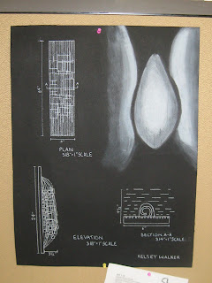
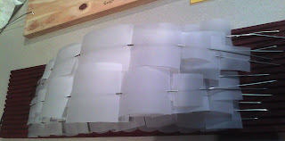
The e cloud consists of 10 ft long squares hanging from the ceiling fading out throughout the whole library. They were to be blue and green at the atrium and then blue in the stacks area and green in the multipurpose room and theater. The whole purpose for these were to bring the rooms together making the whole building flow. This was an issue I have been dealing with all semester with making my projects come together as one and it was nice to see them do this. Some of the issues that arose with this was questions of copying the art work of the e cloud in the San Jose airport and the cost for the installation of the pieces. The students fix for this was to design the e cloud out of recyclable bottles which would change the copyright issues too because in doing that they are designing a different type of piece. They also suggested installing the pieces throughout time to cut cost however I like the previous solution better.
This was the folding walls that came from the ceiling that came down to help better separate the multipurpose room. With this piece and also the movable walls installed in this room, the room can be used for various things such as theater, studying, group presentations, and storage of furniture within the walls. With the library being located near A&T, Bennett, UNCG, and Greensboro College this room can be of great serves to college students in need of areas to practice for anything or get together as a group and study.
I really enjoyed 4th years critic because it helped to put a lot that we have learned this semester into perspective. I felt myself relating issues that I was having with my project to many of the issues and solutions that they came up with for the design of their library. The critic also helped me to take knowledge from what they do and hopefully use it in my future designs.
Wednesday, December 8, 2010
Tuesday, December 7, 2010
Beginning of Lumiare from material to 2nd to last prototype
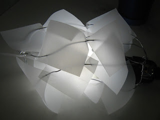
The material I decided to use for my Luminare was silver wire and translucent vellum. I stuck with these two materials throughout my entire project because I liked the simplicity of threading the vellum through the wire which would have been more complex if using a material such as milar. I also really liked the translucency of the paper. I chose to cut my paper is squares because I felt you could get a better feel of the layering. Also, when I think about a could I see the many layers that make it up and when visualising it I see tiny squares of water all coming together to make a huge cloud.
I first wanted to try to make a circular object binding the wire to my light so it all came together as one.
I then played around with the ides of making a stand of my circular object out of wood but before that went into effect I liked the idea of just making arches of wire stretching across a flat board of wood.
I tried placing black sqaures in the center to show darker areas of layer like my light phenomenon represented but this was unsuccessful so I did not use them any further
Issuee I wanted to focus on in my next model and final:
Work on hiding the light better and making it more stable to the board
Figuring a way without using glue to place my wires in the board
Better overall composition that help to show my layers and fading effects better.
I first wanted to try to make a circular object binding the wire to my light so it all came together as one.
I then played around with the ides of making a stand of my circular object out of wood but before that went into effect I liked the idea of just making arches of wire stretching across a flat board of wood.
I tried placing black sqaures in the center to show darker areas of layer like my light phenomenon represented but this was unsuccessful so I did not use them any further
From here I made my 2nd to last model that was on wood. I put 1/8'' grooves every 1/4'' all the way across my board and in every groove I placed a wire. I chose to do this because it helded the wire have more of a relationship with the board in that it all flowed with the wire stopping but having the effect of extending all the way to the end. The placement of my light was in correspondence with the effect of density in my project. The squares were to begin at the bottom and slowly fade out into the wires at the top of the board.
Issuee I wanted to focus on in my next model and final:
Work on hiding the light better and making it more stable to the board
Figuring a way without using glue to place my wires in the board
Better overall composition that help to show my layers and fading effects better.
Creation of Final Luminare
This was my final model that I made before staining my board. I made this model exactly like my final so that I would know if it was going to trun out like I was imagining.
For this model I put my wires in at angle corresponding with each other on each side of the board. Every other wire was the same height. This helped me with cutting the 15 peices of wire used because in doing this I only had one size for all my wires without them all starting at a straight point. I also really focused on not using any binders because I wanted to carry this idea from our other products this semester. I did this by drilling holes on each point where the wire was to be place and then bending the tip of the wire so would fix right into the holes.
I was happy with this model so then begun the creation of my final
Final Luminare
For my Final I decided to center the area of my light, which would be the brightest area, in the center of my board so the area of most density was directly in the middle of my board, fading out on each side. This helped to better balance my board. My board size stayed 24'' long because, I felt as a lighting fixture this was a good size. I drilled a hole to run my cord out the back of my board to take care of it hanging very noticably in the front. On my previous critic, varying the sizes of my sqaure was discussed and in trying this I felt that it helped to show my layering and fading out better. I also stained my board with cherry stain to give it a more finished look and to also better contrast the white squares. My final luminare did not contain any glues or binders (since that was something we had worked with all semester I wanted to keep with that idea) There are holes drilled in the board to hold the wire in and the paper is threaded onto the wire.
Front View
Side View
Side View
My model without the light on
Front View
Side View
My model without the light on
Monday, December 6, 2010
Inspiration for Luminare
For my luminare design I was inspired by two different designers. During our class day light artist presentations I was really inspired by Ingo Maurer's work. Originally I wanted to just use wood to try to represent my light phenomenon but through observing some of Ingo's work that idea changed drastically. A lot of his lights were designed using wire and some type of paper material. It was really interesting and inspiring to see how he used such simple items that we ourselves had been using in previous projects to make very inspiring projects. From looking at his designs I decided to use wire and paper ad the main materials for my project.
One of Ingo Maurer's light fixtures
Later on in my process Leah introduced me to a sculpter in Greensboro named Jim Gallucci. One of his pieces which reminded me of my project was a sculpted gate called fluttergate.
One of Ingo Maurer's light fixtures
Later on in my process Leah introduced me to a sculpter in Greensboro named Jim Gallucci. One of his pieces which reminded me of my project was a sculpted gate called fluttergate.
Fluttergate was inspirational to me because the concept of squares and rods compare to my luminare. The piece is very dense with squares that fade into the rod structure on the left. From the fluttergate I begin to play with my design. I started thinking about how a cloud was made of many layers dense in some areas and less dense in others. From this I wanted to use my wire and paper in a way that my squares layered and cluster and then faded into the wire so that the bottom layering effect represented the density of a cloud and as the squares gradually faded it represented the less dense areas of a cloud.
Most Successful Drawing/ Reflection
I feel like this is my most successful drawing of the whole semester. I have had a lot of drawings I have posted that have represented my progress in shading, line quality, and detail. I like this drawing because I used line strokes and the darkening of line to represent all these important aspects we have been focusing on in class. This is a different technique that I used in this drawing and I feel it was successful in capturing my features.
Reflection:
Coming in to this major I had never had any type of drafting or understanding of the concept of drafting. I was also never a drawer. Yeah of course I doodled and sketched on the side of my papers during boring lecture classes but I never really felt like I could grasp what it took to draw well. I stressed out a lot this semester because it seemed as if nothing was ever turning out like I wanted or that everyone else seemed to be understanding and excelling when I wasn't. I had to keep reminding myself that this was all new to me! Looking back I am really pleased with the progress that I have made throughout the semester. I have learned a lot about drafting, drawing, and composition and although it takes a lot of work and time commitment, I am really looking forward to what we will be learning next semester.
Drawing Contest
Thursday was our last class day so in celebration we had a drawing contest! Through our class period we had models pose and in groups of 6 went up to draw the models for 10 to 15 minutes. The things that we were to focus on was our line quality, expressions, movement, and just show off what we have learned this semester. The drawings that were the most successful represented all these qualities very well. This was my drawing of Molly.
Although I did not win I feel like this drawing had some positive qualities such as every line on the page gave her motion and her clothes movement. My shadowing was successful although I feel I could have used shadows in more of the drawing. I also could have used less sketchy lines to represent Molly. Overall I feel very positive about this piece. People are very difficult to draw but I have came a long way since we started. Now the only thing to get out there and do is draw!
Although I did not win I feel like this drawing had some positive qualities such as every line on the page gave her motion and her clothes movement. My shadowing was successful although I feel I could have used shadows in more of the drawing. I also could have used less sketchy lines to represent Molly. Overall I feel very positive about this piece. People are very difficult to draw but I have came a long way since we started. Now the only thing to get out there and do is draw!
Subscribe to:
Comments (Atom)


